Tigerair Rebrand | Tigerair | 2013
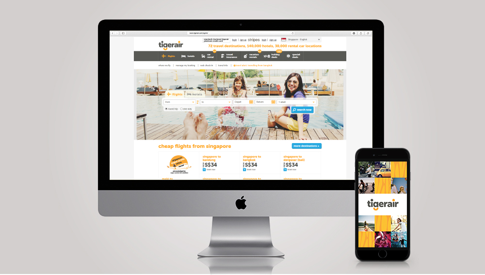
As part of its repositioning exercise in the low cost carrier industry, Tigerair decided to evolve from their old Tiger Airways identity into something more relevant and contemporary to the modern traveler. To that, we are tasked with creating a simpler yet distinctive branding system which allows Tigerair to stand out among its rivals.
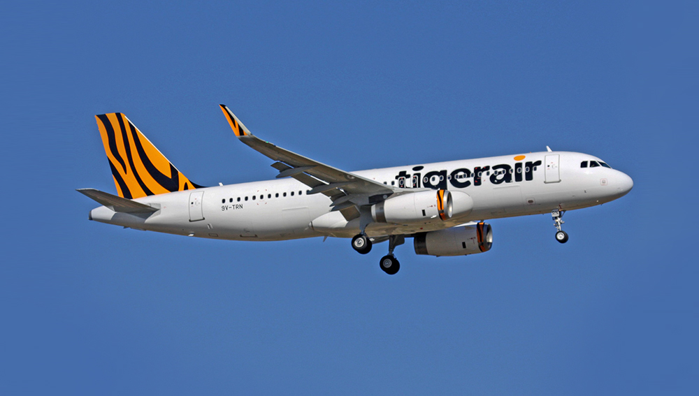
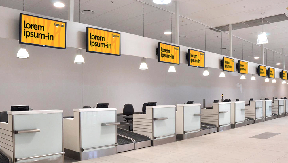
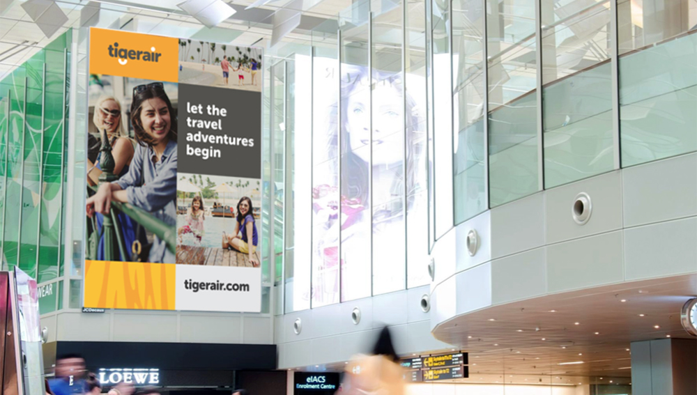
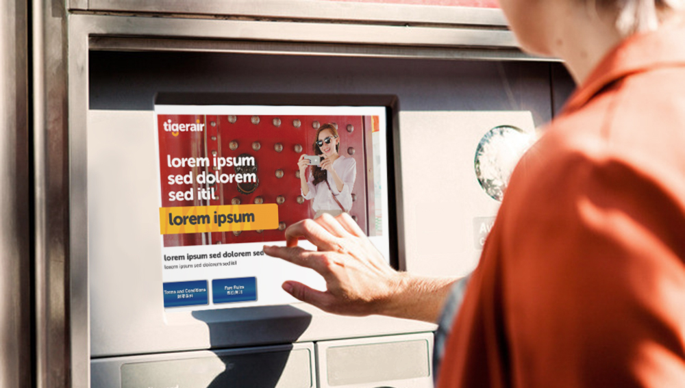
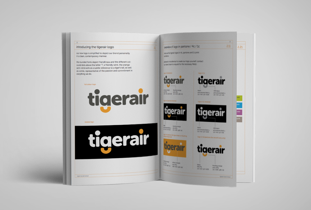
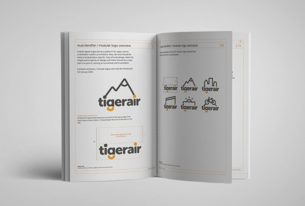
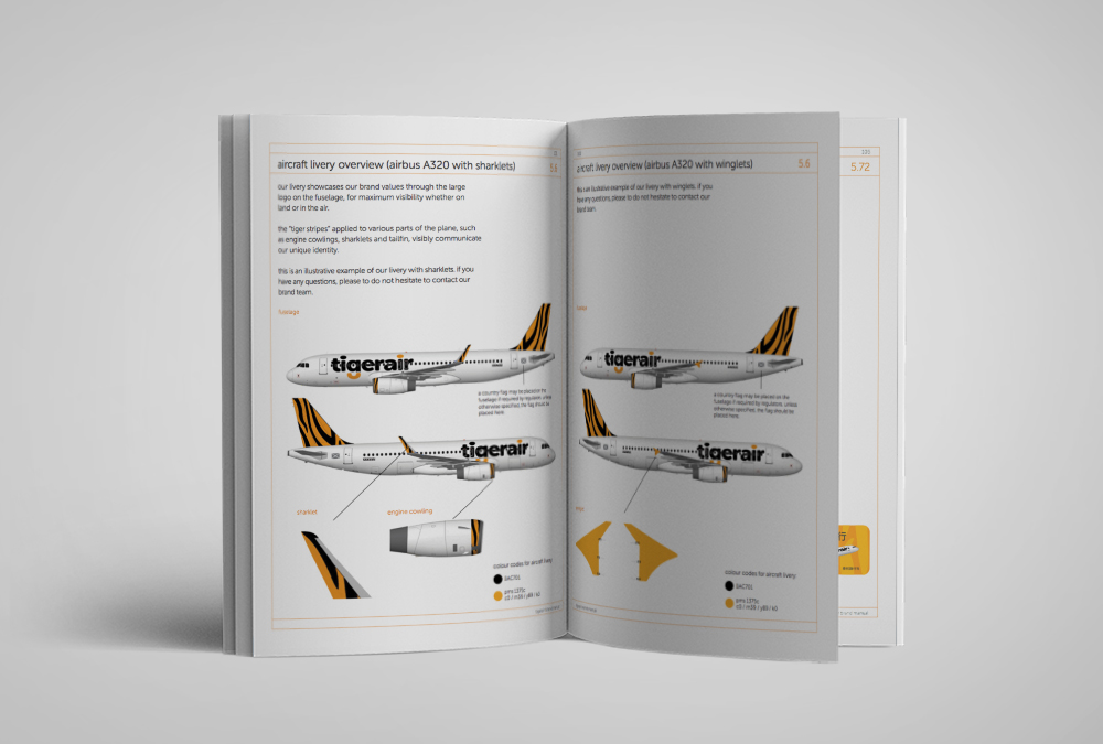
The rounded fonts in the new logo depict friendliness, and the different coloured dot above the letter “i”, a friendly wink. The orange semi-circle acts as a subtle reference to a tiger’s tail, as well as a smile. The same traits are followed within the branding system, where the orange tiger stripes serve as the distinctive mark on every touchpoint.
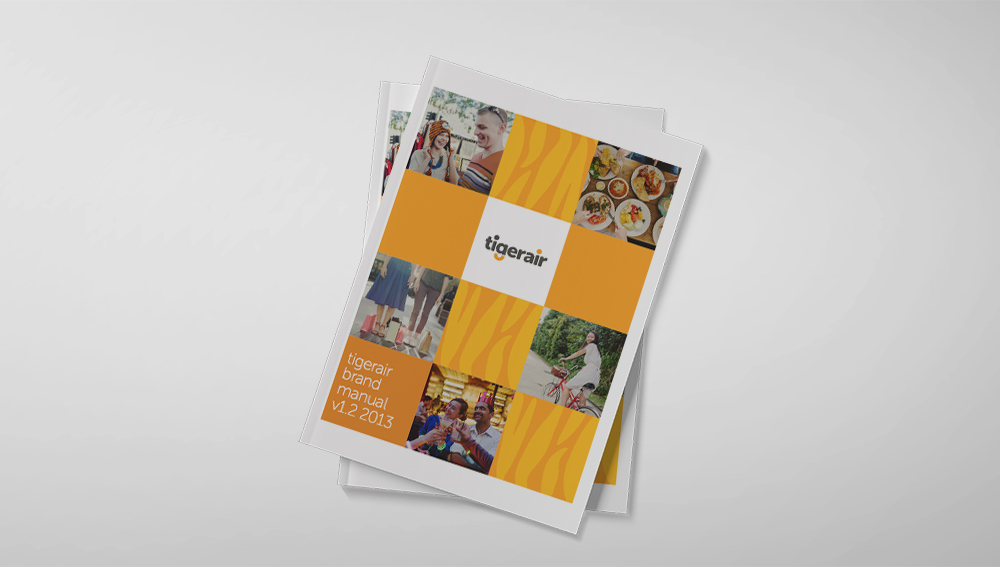
The end result of this comprehensive rebranding exercise is a 150-page brand guidelines which features content ranging from brand story to all the various touchpoints.
Project involvement:
Brand + Visual guidelines development
Completed at The Secret Little Agency.
![]()